Custom Column Renderer
The table UI representation for an Aspect Model per default renders the values as text. However, when creating the table using schematics, you can let schematics create additional, customizable columns.
One way to render the content of the column is to use the Angular ng-template directive, another way is to create a custom component to individually render the content of a column. The latter choice is recommended especially if business logic is involved for rendering the content.
Example showing a traffic light in a column
The following example show how to implement and offer a column with graphical content using Scalable Vector Graphics (SVG).
Alternative A: Render column content using ng-template
This is the recommended approach if no business logic is involved.
Step A1: Create graphical representation
Let’s say that the table row includes an attribute speedLimitWarning that can be one of red, yellow or green.
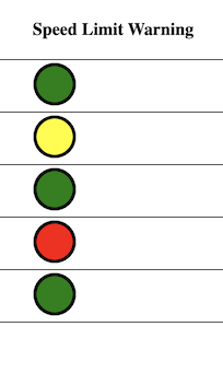
Drawing a circle and filling it with one of these colors can be done in the following way inside a ng-template:
<ng-template #speedLimitWarningTemplate let-speedLimitWarningColor="speedLimitWarning">
  <svg width="40" height="40">
    <circle cx="20" cy="20" r="18" stroke="black" stroke-width="3"
      [attr.fill]="speedLimitWarningColor"
    />
  </svg>
</ng-template>
There is a ng-template variable speedLimitWarningColor that is defined using in combination with the prefix let-, and its value is set by the variable speedLimitWarning within the context of the calling parent component (the table column).
Step A2: Connect the parent component with this child component
At the table column, add a ng-container statement as follows:
<!-- speedLimitWarning Column -->
<ng-container matColumnDef="speedLimitWarning">
  <th mat-header-cell *matHeaderCellDef mat-sort-header>{{ 'movement.v100.speedLimitWarning.preferredName' | transloco }}</th>

  <td mat-cell *matCellDef="let row">
    <!-- {{ row.speedLimitWarning || '-' }} -->
    <ng-container *ngTemplateOutlet="speedLimitWarningTemplate;context:row"></ng-container>
  </td>
</ng-container>
This embeds the ng-template with the id speedLimitWarningTemplate inside the column and uses the current row as the context for the child component.
Alternative B: Render column content using a component
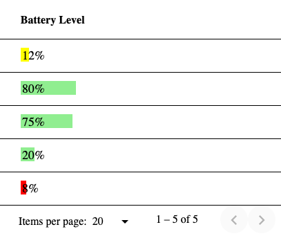
This is the recommended approach if business logic is involved for rendering the component. In this example, depending on a percentage between 0% and 100% of remaining battery power, the color of the bar is changed.
Step B1: Create a new UI component
By creating a new UI component, we keep the rendering isolated from the generated table UI component.
ng generate component svg-bar-indicatorBy default, the new component got the selector app-svg-bar-indicator, so it can be used in any Angular template:
<app-svg-bar-indicator></app-svg-bar-indicator>By default, only the text svg-bar-indicator works! is printed out. Let’s replace that by a SVG image.
Step B2: Create a static SVG image
Change file svg-bar-indicator.component.html as follows:
<svg width="100" height="20">
  <rect x="0" y="0" width="80" height="20" fill="lightgreen" />
  <text x="2" y="17" font-size="20px">80%</text>
</svg>
This draws a fixed green bar with a width of 80 pixels and a text with "80%".
Step B3: Create a dynamic SVG image
Change file svg-bar-indicator.component.html as follows:
<svg width="100" height="20">
  <rect x="0" y="0" [attr.width]="indicatorValue" height="20" [attr.fill]="indicatorColor" />
  <text x="2" y="17" font-size="18px">{{ indicatorValue }}%</text>
</svg>
This introduces the two component properties indicatorValue and indicatorValue. indicatorValue specifies the length of the bar and the text label, indicatorColor specifies the color of the bar.
Now, the necessary modifications in svg-bar-indicator.component.ts:
import { Component, OnInit, Input, OnChanges, SimpleChanges } from '@angular/core';

@Component({
selector: 'app-svg-bar-indicator',
templateUrl: './svg-bar-indicator.component.html',
styleUrls: ['./svg-bar-indicator.component.css']
})
export class SvgBarIndicatorComponent implements OnInit, OnChanges {

  @Input() indicatorValue: number = 0;
  indicatorColor: string;

  constructor() {
    this.indicatorColor = 'lightgreen';
  }

  ngOnInit(): void {
  }

  ngOnChanges(changes: SimpleChanges): void {
    if (changes.indicatorValue.currentValue >= 20) {
      this.indicatorColor = 'lightgreen';
    } else if (changes.indicatorValue.currentValue >= 10) {
      this.indicatorColor = 'yellow';
    } else {
      this.indicatorColor = 'red';
    }
  }
}
The @Input() decorator allows that this property can receive its value from the parent component.
On changes of the property indicatorValue, there is a small section of business logic that defines the fill color of the bar, depending on the value of indicatorValue.
Step B4: Connect the parent component with this child component
You can directly integrate this component in the respective column of the table as follows:
<!-- batteryLevel Column -->
<ng-container matColumnDef="batteryLevel">
  <th mat-header-cell *matHeaderCellDef mat-sort-header>{{ 'movement.v100.batteryLevel.preferredName' | transloco }}</th>

  <td mat-cell *matCellDef="let row">
    <app-svg-bar-indicator [indicatorValue]="row.batteryLevel"></app-svg-bar-indicator>
  </td>
</ng-container>